Most people searching for personal website examples are not really looking for decoration. They are trying to answer a harder question: what kind of online presence actually fits a person?
That is why this topic gets messy fast. One personal site is a polished portfolio. Another is a single page with a short bio and three links. Another is mostly essays. Another feels almost anonymous on purpose. They all count, but they solve different problems.
This guide organizes the field so you can study personal website examples by format, not just by surface style. That matters because the right direction depends less on trends and more on what you need the site to do.
If you are comparing approaches to stripped-back web design, it also helps to read our guide to minimalist website design examples and browse the wider Resources archive. Both connect closely to the same question of how much a page can say with less.
Short answer: the best personal website examples make one decision clearly. They choose a format, a voice, and a level of proof that matches the person behind the page.
What makes personal website examples worth studying
A good personal website does not just look nice in a screenshot. It makes a visitor understand who you are, what you do, and what kind of interaction should happen next.
That may sound obvious, but many personal sites get trapped between identities. They want to be a portfolio, blog, resume, studio site, newsletter hub, and social landing page all at once. The result is a page with too many weak signals and no governing idea.
The better examples do three things well.
- They choose a dominant format. Visitors can tell quickly whether the site is mainly about work, writing, reputation, or contact.
- They provide the right kind of proof. A designer may need selected projects. A writer may need essays. A consultant may need a sharp point of view and a clear way to get in touch.
- They sound like a person. Even restrained sites still have a voice. The wording, pacing, and structure reveal judgment.
That last point matters more than many templates admit. According to the W3C guidance on headings, clear heading structure helps people understand organization quickly. On a personal site, that clarity is not just an accessibility issue. It is also a branding issue. When the structure is obvious, the personality has more room to come through naturally.
The five main types of personal website examples
When people trade links to personal website examples, they often mix together formats that should be judged differently. It is more useful to group them by the job they do.
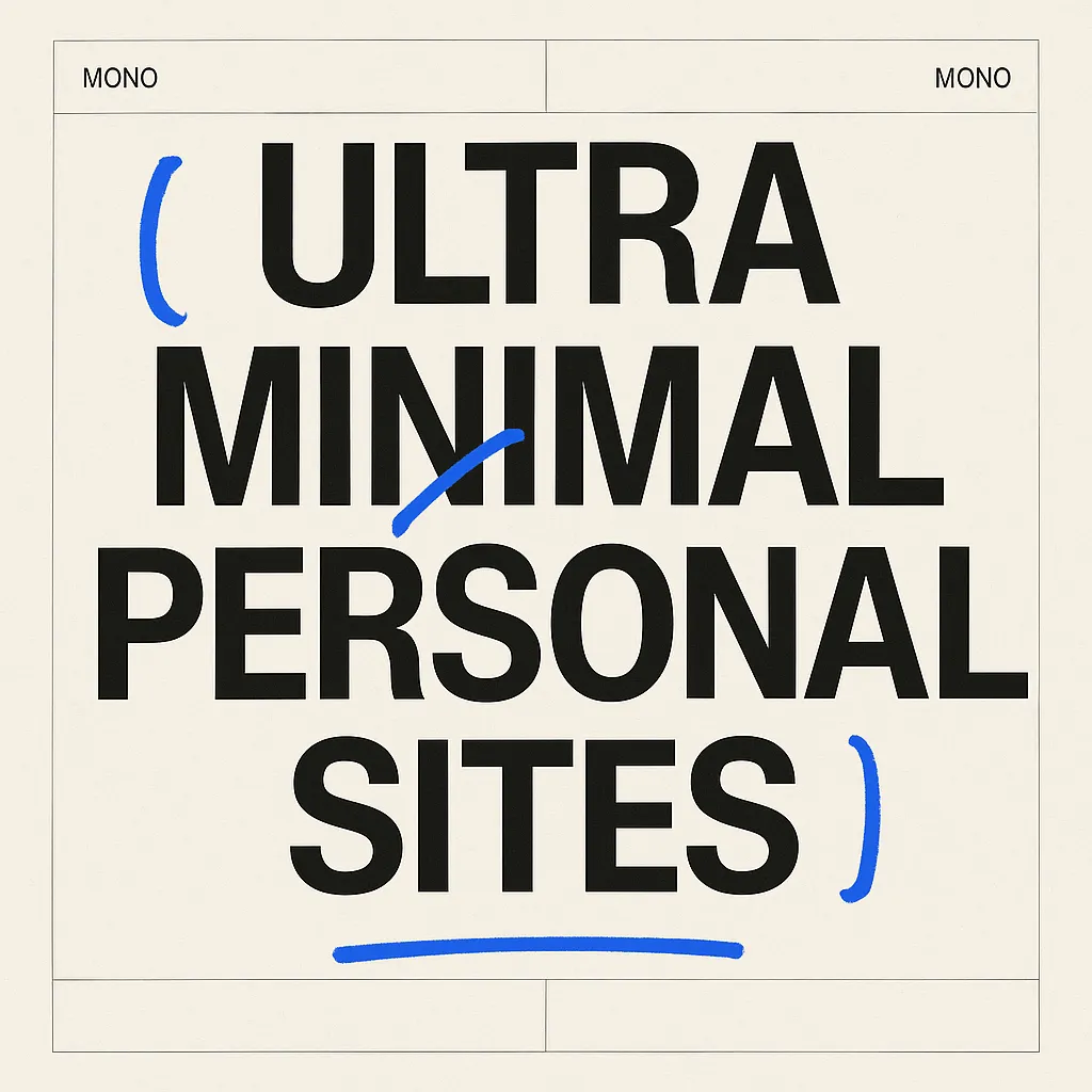
1. Ultra-minimal personal sites
These sites use extreme restraint. Often there is a plain intro, a short statement, a few links, and very little else. When they work, they feel confident. When they fail, they feel unfinished.
The useful lesson is that ultra-minimal does not mean low-effort. It means very selective. Every line has to justify itself.
Best for: operators, developers, writers, researchers, and anyone whose credibility comes from clarity more than spectacle.
What to study: how little navigation they use, how quickly they establish identity, and whether the page still feels complete without explanation panels or visual garnish.
Main risk: confusion. If visitors cannot tell what you actually do, minimalism becomes concealment.
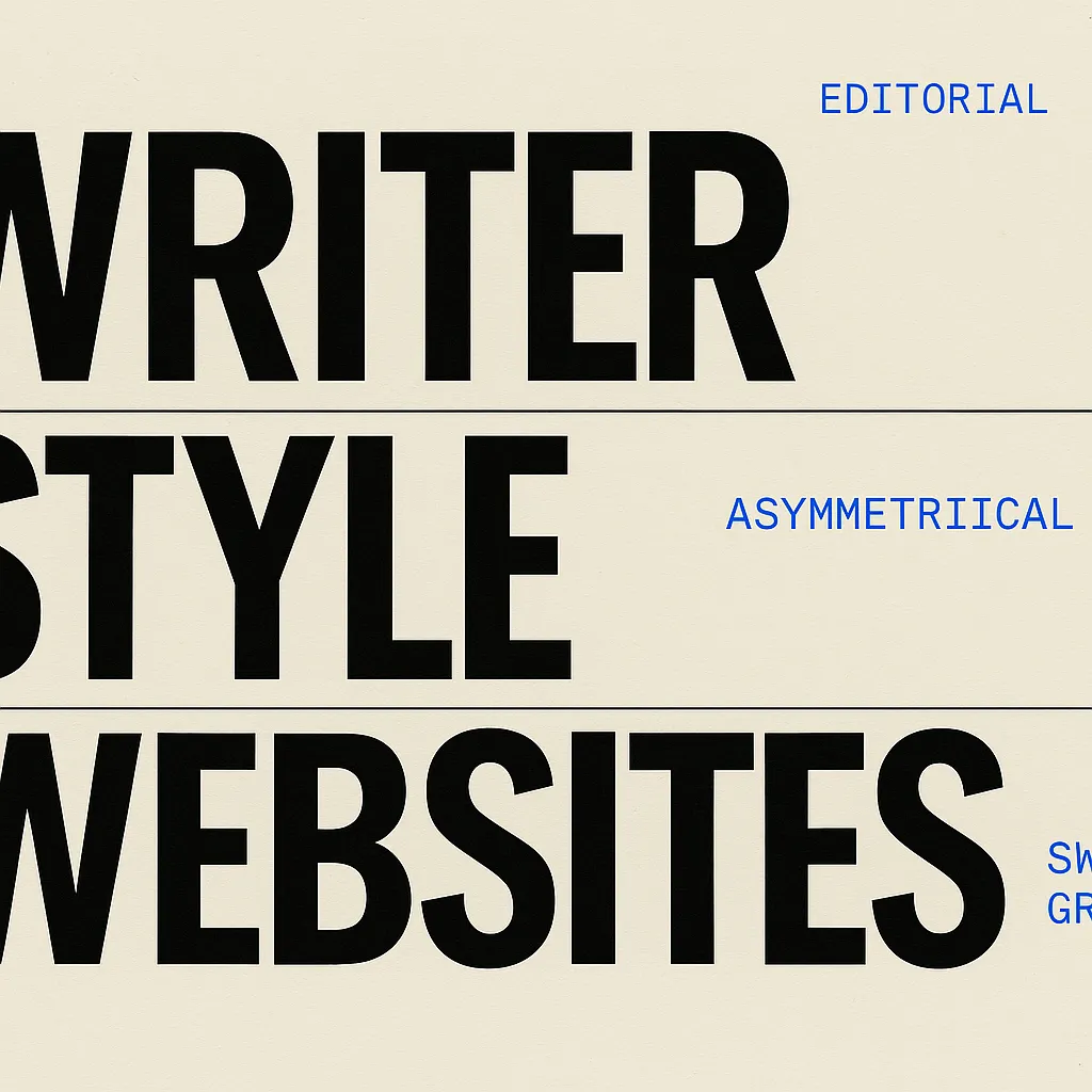
2. Writer-style personal sites
These sites are built around reading. The homepage often acts as an index of essays, notes, or ideas instead of a promotional pitch. The strongest versions feel generous and steady. They are less interested in selling an identity than in letting the body of work speak.
Writer-style sites are especially good examples for people who want their site to feel thoughtful rather than polished in a startup sense. They show that authority can come from publishing rhythm, archives, and tone instead of thumbnails and case-study theater.
Best for: writers, strategists, researchers, educators, and people with a body of thinking that benefits from an archive.
What to study: title treatment, archives, category structure, reading width, and how the homepage balances recent work with long-term orientation.
Main risk: burying the introduction. Some writer sites assume too much familiarity and make new visitors work too hard to understand the person behind the archive.
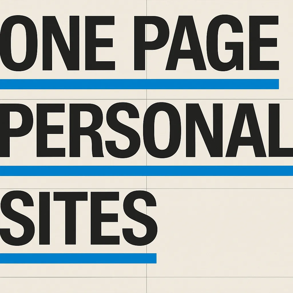
3. One-page personal sites
One-page sites compress the whole introduction into a single vertical sequence. Usually that means a short hero, selected work or links, maybe a brief bio, and one clear contact route.
This format works better than many people think. In fact, for people with a narrow goal, it can outperform a bigger site because it keeps the decision surface small. The challenge is knowing when to stop. A one-page site should feel edited, not crowded.
Best for: freelancers, job seekers, early-career creatives, speakers, and people who mainly need a sharp public landing page.
What to study: sequencing, section length, internal rhythm, and whether the page ends with a clear next step.
Main risk: overstuffing. Once the page tries to hold a whole portfolio, full biography, writing archive, and testimonials, the single-page advantage disappears.
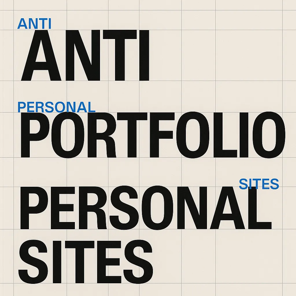
4. Anti-portfolio personal sites
This is one of the most interesting groups. Anti-portfolio sites reject the default assumptions of modern personal branding. They may hide project thumbnails, downplay self-promotion, or use blunt text instead of glossy presentation. The point is not laziness. The point is a different theory of credibility.
These sites can feel sharper, funnier, or more believable because they resist performance. They suggest that taste, writing, and editorial control can be proof in their own right.
Best for: people with strong reputational signals, strong writing, a defined niche, or a deliberate aversion to visual clutter.
What to study: tone, restraint, selective proof, and how they turn omission into identity rather than absence.
Main risk: becoming too private or too cryptic. Refusal is only useful when the visitor still has enough context to trust you.
5. Hybrid personal sites
Hybrid sites combine several of the above. They might have a concise homepage, a writing archive, a lightweight portfolio, and a speaking or links page. Many excellent personal websites are hybrids. The difference is that strong hybrids still make their hierarchy obvious.
In other words, hybrid should describe scope, not confusion.
Best for: established people whose work crosses modes.
What to study: which section leads, how navigation is labeled, and whether the homepage clarifies the relationship between the parts.
Main risk: building a site map before building a point of view.
Personal website examples by format and what each teaches
Below are a few real references and what makes them useful to study. The point is not to copy them literally. The point is to understand what each format privileges.
Seth Godin
Seth Godin’s site is a strong example of a writer-led personal website. The emphasis is on publishing and point of view. The site does not need portfolio-style persuasion because the archive itself is the proof.
Lesson: when the writing is the product, put the writing first.
Austin Kleon
Austin Kleon’s site shows a more visibly authored personal presence. It still supports books, essays, events, and other work, but it remains cohesive because the voice is unmistakable and the structure is straightforward.
Lesson: personality does not require clutter. It requires consistency.
Tobias van Schneider
Tobias van Schneider’s site is useful as a more portfolio-adjacent reference. It is richer than the stark examples in this article, but it demonstrates how a strong personal brand can extend across projects, essays, and products without losing identity.
Lesson: a larger personal site still works when one voice governs everything.
Text-first experiments and anti-portfolio directions
There are also personal sites that are more useful as a class than as a single famous example. This is the territory where text-first, anti-portfolio, and ultra-minimal approaches overlap. These sites often rely on plain HTML habits, severe typography, direct writing, and visible structure instead of image-heavy project cards.
That is part of where Too Big or Not Sites fits. It is not a conventional personal website, but it is a useful reference for anyone considering a personal site that rejects visual clutter. The premise is simple: if a page can hold attention through type, spacing, sequence, and voice alone, the underlying system is probably strong.
How to choose the right type of personal website
Before collecting more personal website examples, decide what your site is mainly for. Most people only need one of these four goals to lead.
Goal 1: You want to be understood quickly
Choose an ultra-minimal or one-page format. Lead with a plain statement of who you are, what you do, and where you want the visitor to go next.
Goal 2: You want your thinking to be the proof
Choose a writer-style format. Make the archive easy to scan. Keep the homepage simple. Let categories, titles, and consistency build authority over time.
Goal 3: You need selected work to do the selling
Choose a portfolio-leaning hybrid. Show fewer projects, but give them enough room and context to matter.
Goal 4: You want to signal taste through refusal
Choose an anti-portfolio direction carefully. Remove default elements only if the remaining structure still creates trust. Strong omission is a decision. Weak omission is just missing information.
The practical test is simple: if someone landed on your site with no prior context, what would they understand in ten seconds? If the answer is not clear, the format is probably still undecided.
Common mistakes people make after studying personal website examples
Copying the aesthetics but not the logic
This is the most common failure. People copy spacing, plain backgrounds, lowercase nav, or sparse layouts without noticing the structural reason those choices work. The result looks similar at first glance but feels hollow in use.
Adding every possible section
A personal website does not become more complete by collecting every standard module. In many cases, adding speaking, testimonials, newsletter, portfolio, archive, press, and social blocks all at once makes the site feel less personal and more template-bound.
Using vague language
Minimal sites especially cannot afford vague copy. If the headline says something broad like building meaningful experiences, the page immediately loses force. Say the actual thing.
Underestimating readability
Personal sites are often judged by taste, but they are used through reading. The MDN guidance on semantic HTML is relevant here because structure affects comprehension, not just code quality. Likewise, the W3C explanation of minimum contrast is a reminder that visual restraint should never make text harder to read.
A practical framework for evaluating personal website examples
Use this checklist when comparing references.
- Identity: Is it clear who the site belongs to and what kind of person this is?
- Format: Can you tell whether it is primarily a portfolio, archive, one-page intro, or hybrid?
- Proof: Is the evidence appropriate to the person’s work?
- Voice: Does the wording sound specific, not generated?
- Readability: Are hierarchy, spacing, and contrast doing real work?
- Next step: Is the desired action or direction obvious?
If a site scores well on those six points, it is probably worth saving. If it only wins on visual taste, it may not help much when you sit down to build your own.
Where Too Big or Not Sites fits in
Too Big or Not Sites is not here to pretend every personal website should be text-only. It is here to make one argument clearly: a personal site can be memorable without images, cards, or visual noise if the typography and structure are handled with discipline.
That makes it relevant to anyone researching personal website examples because it strips away the usual excuses. If a page still feels deliberate when almost nothing is left, the hierarchy is probably sound. If it collapses without decorative support, the design was leaning on props.
For readers exploring that sharper end of the spectrum, the site’s blog archive, the Resources category, and our guide to minimalist website design examples all push the same question from slightly different angles: what is the fewest number of moves a website can make while still feeling complete?
Final take
The best personal website examples are not the prettiest ones. They are the clearest ones.
They know what kind of site they are. They understand what proof matters. They use tone intentionally. They remove what does not help. And they do not confuse personal expression with visual excess.
If you are deciding what your own site should look like, start by choosing the format before you choose the style. Writer-style, one-page, ultra-minimal, anti-portfolio, or hybrid. Once that decision is clear, the rest of the design gets much easier.
FAQ
What should a personal website include?
A personal website should usually include a clear introduction, a short explanation of what you do or care about, a simple way to contact you, and only the supporting sections that strengthen that story. For some people that means a portfolio. For others it means writing, notes, links, or a single focused page.
Do personal websites need a portfolio?
No. A portfolio helps when your work is visual or project based, but many strong personal websites are writer-led, note-driven, or intentionally minimal. The site should match the kind of proof your audience actually needs.
Is a one-page personal website enough?
Often yes. A one-page personal website can work well if your goal is to introduce yourself clearly, show a few selected links or projects, and make the next step obvious. It becomes limiting only when your writing, archive, or body of work needs more room.
How do I make a personal website feel less generic?
Make fewer, clearer decisions. Use a stronger headline, a more specific point of view, tighter navigation, and a visual system that reflects your tone. Generic personal websites usually try to imitate everyone at once instead of choosing a format that fits the person.
Can a text only personal website work?
Yes. A text only personal website can work extremely well when the typography, spacing, and structure are disciplined. If the writing is strong and the hierarchy is obvious, removing images can make the site feel more distinctive rather than less complete.