Most people searching for one page website examples are not just looking for design inspiration. They are trying to decide whether a single-scroll format is actually smart for what they need to build.
That distinction matters. A one page website can feel sharp, fast, and unusually confident when the scope is tight. It can also feel cramped, vague, and structurally trapped when too many jobs are forced into one page.
So this article does not just collect examples. It explains why some one-page websites work, where they break down, and how to structure one so it feels complete instead of improvised.
If you are comparing stripped-back formats, it also helps to read our guide to minimalist website design examples, browse the full Resources category, and compare this topic with our breakdown of personal website examples. All three are really versions of the same question: how much can one page do before it should become a system.
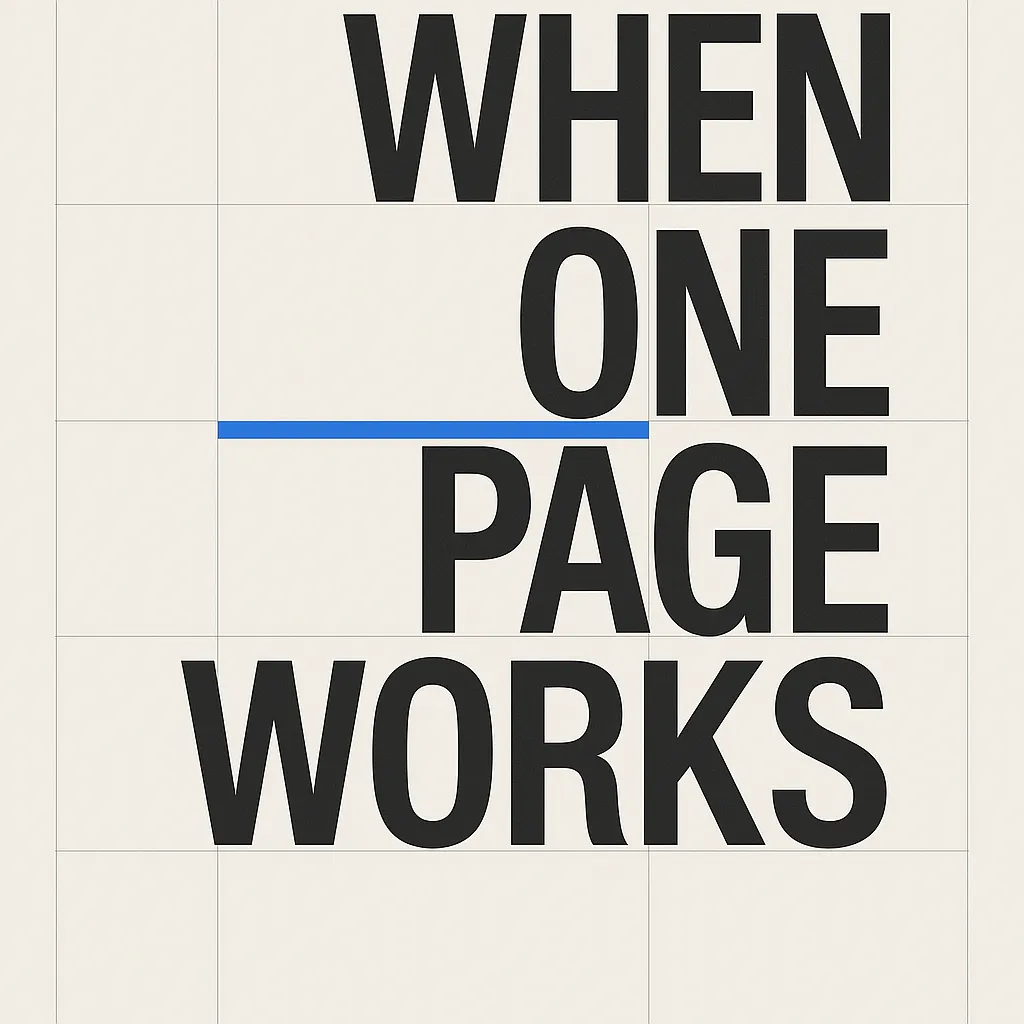
Short answer: the best one page website examples feel like a controlled sequence. Each section earns the next, the purpose stays narrow, and the page never asks the visitor to choose between too many competing directions.
Why people look for one page website examples in the first place
Usually because they want one of four things.
- Simplicity. They want fewer pages to design, write, and maintain.
- Focus. They want one clear story and one main call to action.
- Speed. They want to launch quickly without inventing a larger site structure.
- Restraint. They want the site to feel edited rather than bloated.
Those are good reasons. But they only stay good if the page still has a clear information structure. That is why the W3C guidance on headings matters here. Headings help people understand organization quickly. On a one-page website, that job becomes even more important because the visitor is moving through one long vertical argument instead of navigating several separate pages.
The search for one page website examples is really a search for fit. People want to know whether one page is enough, and if it is, what that page should contain.
When a one page website works best
One-page websites work best when the offer is narrow, the audience is clear, and the next step is obvious.
That usually includes cases like these:
- A single service business with one main inquiry goal.
- An event page that needs schedule, context, and registration in one flow.
- A product launch page for one specific release.
- A portfolio landing page that introduces a person and routes to contact or selected work.
- A campaign page built around one message and one conversion action.
- A concept or demo site where the format itself is part of the point.
The classic strength of the one-page format is compression. It removes navigational drift. Instead of asking the visitor where to go next, the page answers that question through sequence.
That is why one-page design is often stronger than a larger site for simple cases. A small offer does not always need a bigger architecture. Sometimes it needs a cleaner path.
Three conditions that usually signal good one-page fit
- You can describe the site’s purpose in one sentence. If the purpose keeps branching, the structure usually should too.
- You are targeting one primary search intent. Not every keyword and audience needs its own page, but very different intents usually do.
- The page has one dominant conversion action. Inquiry, signup, purchase, RSVP, or contact. If every section asks for a different outcome, momentum breaks.
One page website examples by type
Not all one-page websites are trying to do the same job. It helps to group examples by format rather than by surface style.
1. Single-service websites
This is often the strongest use case. A focused service site can explain the offer, describe who it is for, show proof, answer common objections, and invite contact without needing a large navigation system.
What makes the format work: the service is specific enough that the visitor does not need separate pages for every question.
What to watch for: as soon as the business has multiple services, industries, or locations, the single-page advantage starts to turn into a content bottleneck.
2. Event and launch pages
These are almost naturally one-page websites. Visitors want the promise, the date, the location or format, the schedule, and the registration path in one place.
What makes the format work: the intent is immediate and time-bound.
What to watch for: if the event grows into an archive, community, or multi-program platform, it usually needs more than one page.
3. Personal landing pages
This type sits between a bio page and a full personal website. It works especially well when the goal is a clear introduction, selected links, and a direct contact route.
What makes the format work: a person can often be introduced more effectively through a single sequence than through a sprawling self-archive.
What to watch for: if writing, projects, or case studies need depth, a single page may become a teaser instead of a full presence.
4. Product campaign pages
Landing pages for one product or one campaign often benefit from the one-page format because they can control narrative flow tightly: problem, promise, proof, details, objections, action.
What makes the format work: one offer, one audience, one story.
What to watch for: if the page has to rank for many different feature-level or use-case queries, it may need supporting pages.
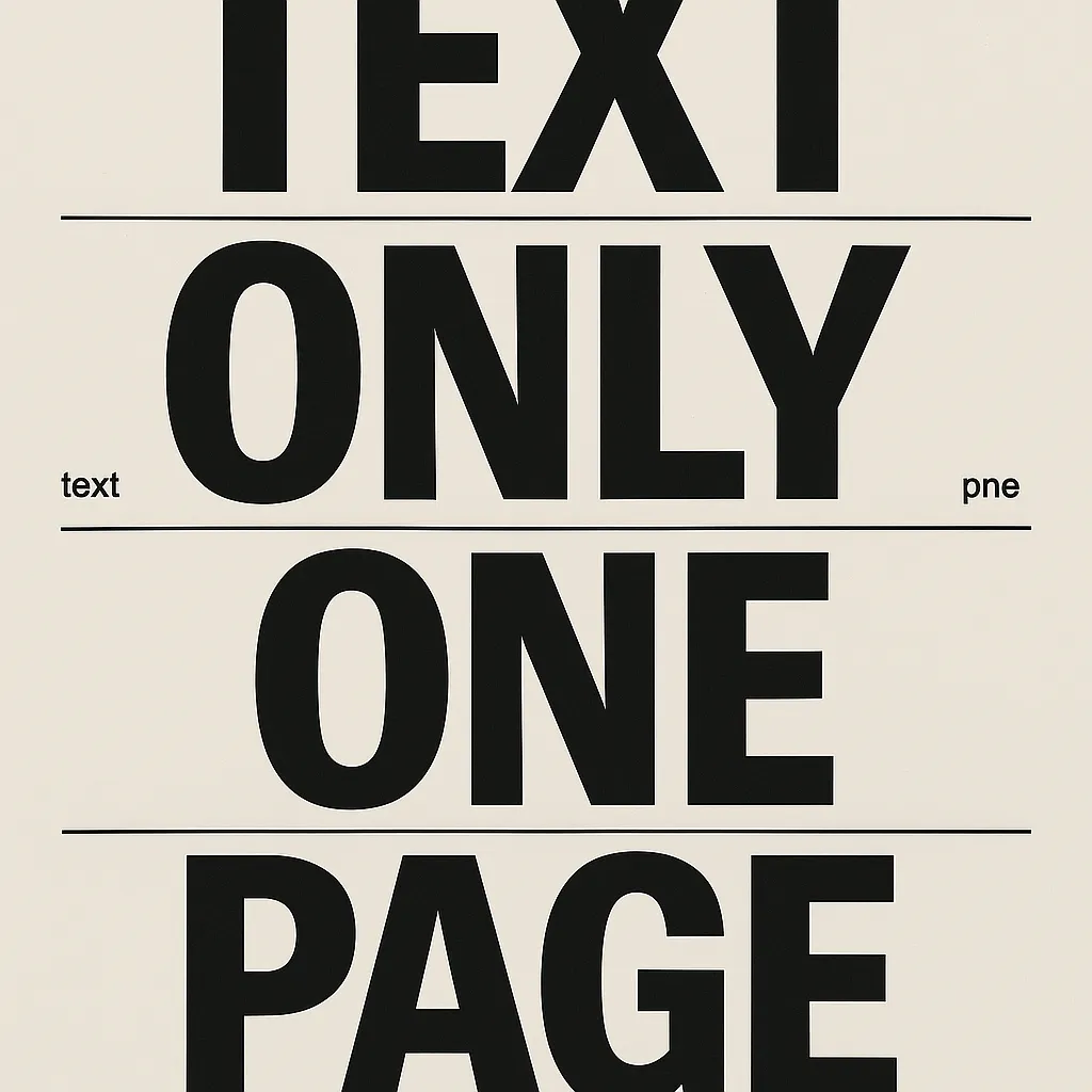
5. Text-only demo sites
This is the most interesting category for this website, because it strips the format to its bones. If a text-only one page website still feels engaging, then the hierarchy is real. The layout is not being rescued by imagery.
That is part of what Too Big or Not Sites demonstrates. The site is intentionally non-commercial and intentionally spare. It uses text, spacing, grid logic, and sequencing as the main interface. That makes it a useful one page website example not because everyone should copy it, but because it shows how much structure can do when visual clutter is removed.
What the best one page website examples have in common
They establish the point immediately
The opening section does not stall. It states what the site is, who it is for, or what the visitor should understand first. That is especially important on one-page websites because there is no second page to clarify a weak introduction.
They move in a logical order
Good one-page sites feel almost editorial. One section creates the need for the next. The sequence often follows a familiar arc: context, offer, proof, objections, action.
They use headings like navigation
Even if the page has anchor links, the section headings themselves do a lot of navigational work. They help scanning readers understand where they are and decide whether to keep going.
That lines up with MDN’s emphasis that headings should have visible, meaningful text and should represent actual structure, not just styling tricks. See MDN’s accessibility guidance on text labels and headings.
They control section length
One-page websites fail when each section behaves like a full page. The point is compression, not accumulation. If every section becomes long enough to need its own table of contents, the single-scroll advantage is gone.
They end with a clear decision
A good one-page website does not simply stop. It closes the argument and makes the next action obvious.
How to structure a one page website so it feels complete
If you study a lot of one page website examples, a repeatable pattern starts to appear. The specific language changes, but the sequence stays surprisingly stable.
Section 1: The opening statement
Say the actual thing. What is this page? Who is it for? Why should the visitor care? Do not spend the first screen being tasteful but unclear.
Section 2: The short explanation
Expand the promise without trying to answer everything. This section exists to make the visitor feel oriented, not overwhelmed.
Section 3: The supporting proof
Use examples, outcomes, selected features, testimonials, credentials, or clarifying specifics. The right kind of proof depends on the page, but some form of evidence usually belongs here.
Section 4: The friction reducer
This is where objections, FAQs, process notes, pricing ranges, or constraints often belong. In many weak one-page sites, this material is missing, which is why the page feels elegant but incomplete.
Section 5: The close
End with one clear next step. One-page websites are at their best when they reduce decision overhead, not multiply it.
Notice what is missing from that list: random extra modules. Many one-page websites get worse when teams add every default block they have seen elsewhere.
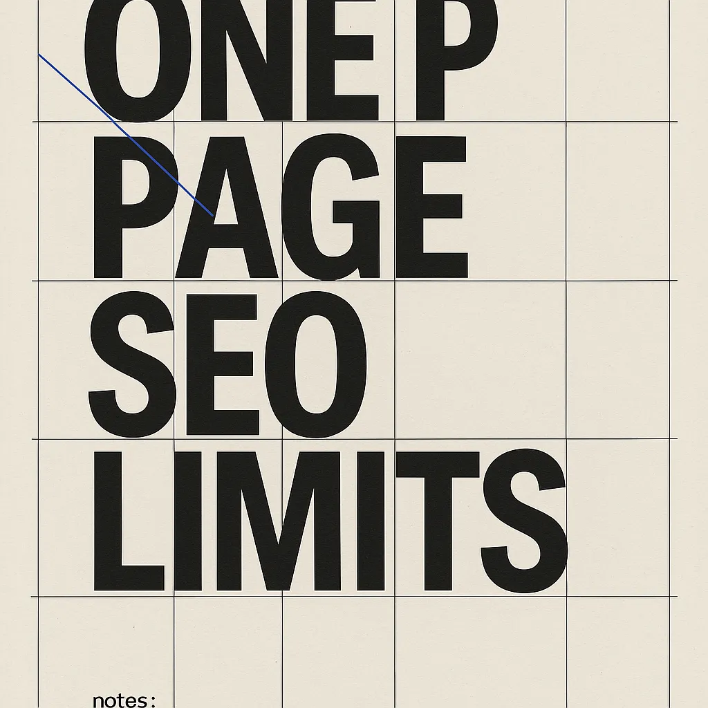
Are one page websites bad for SEO
Not by definition. A one page website can rank perfectly well when it targets a narrow subject and satisfies one main intent thoroughly.
But one-page sites do create real SEO tradeoffs. The issue is not that search engines reject them. The issue is that one URL can only organize so many distinct topics clearly before it starts flattening them together.
That leads to a simple rule.
- Good SEO fit for one page: one offer, one location or no location complexity, one main keyword cluster, one dominant conversion path.
- Poor SEO fit for one page: multiple services, multiple cities, many use cases, many industries, or a need to publish educational content around different questions.
So if someone asks whether one-page websites are bad for SEO, the honest answer is: they are often good for focused SEO and weak for broad SEO.
If the site eventually needs to target multiple topics, a stronger move is often to keep the homepage sharp and add supporting pages around specific services or content themes. That is also why the blog archive on this site exists beside the homepage rather than forcing every topic into one surface.
Real one page website examples and what they teach
Some examples are useful because they are literally one page. Others are useful because they show one-page logic clearly, even if they live inside a larger domain. The lesson is the structure, not whether the project passes a purity test.
Purple
Purple is not a pure one-page website, but it is a strong example of campaign-style narrative flow on commercial pages. Product storytelling, proof, differentiation, and action are often stacked in a single controlled sequence.
Lesson: even when a brand has many pages, one-page thinking can still improve clarity on the pages that matter most.
Seth Godin
Seth Godin’s site is useful for the opposite reason. It shows how little chrome a text-led presence needs when the content itself carries authority.
Lesson: a page can feel complete through structure and tone even when it refuses most modern website furniture.
Squarespace one-page examples
Squarespace’s one-page website examples guide is useful because it names several formats that naturally fit a single-scroll structure, including communities, events, and single-product launches.
Lesson: one-page websites tend to work best when the page has a narrow goal and the sections can read as one uninterrupted case.
Too Big or Not Sites
Too Big or Not Sites pushes one-page logic into a stricter text-only direction. It is not trying to sell a product. It is trying to show that hierarchy, spacing, and sequencing can carry an experience without image support.
Lesson: text-only execution is a brutal but useful test. If the page still works, the structure is probably doing real work.
How text-only execution makes a one-page website stronger
On many websites, images cover structural mistakes. A weak headline gets hidden under a striking photo. Thin content gets padded by cards. Missing transitions between sections get disguised by visual novelty.
Text-only pages remove those distractions.
That is why they are such useful examples. They reveal whether the page can stand on sequence alone. The reader has nothing to look at except the order of ideas, the tone of the writing, and the control of the typography.
When that works, it feels unusually sharp. Not because the page is empty, but because every remaining element has a job.
This is exactly the case for a site like Too Big or Not Sites. The page does not feel finished despite the lack of images. It feels finished because the page has accepted the discipline that lack of images requires.
Common mistakes people make after studying one page website examples
They confuse less content with less thinking
A one-page website is not easier because it has fewer pages. In many cases it is harder, because everything important has to fit into one reading path.
They overstuff the page
This is the most common failure. The site starts as a simple landing page, then absorbs an about section, services, case studies, testimonials, process, pricing, FAQ, blog previews, newsletter, and footer navigation. At that point it is behaving like six pages taped together.
They underwrite the opening
Minimal pages cannot afford vague copy. If the first screen is stylish but unclear, the whole page has already lost force.
They skip proof
One-page websites often try to stay clean by omitting evidence. That usually backfires. The cleaner the page, the more important the proof becomes.
They ignore readability
Long single-scroll pages rise or fall on reading comfort. Line length, contrast, heading spacing, and section rhythm matter more than clever visual restraint.
A simple checklist for evaluating one page website examples
- Can you explain the page’s purpose in one sentence?
- Does the first screen make the purpose obvious?
- Do the sections follow a real argument?
- Is there one dominant action at the end?
- Does the page include enough proof to build trust?
- Would any section be stronger as its own page?
- Does the page still feel readable after a long scroll?
If the answer to several of these is no, the design may still look clean in a screenshot, but it is probably not using the one-page format well.
Where Too Big or Not Sites fits in
Too Big or Not Sites is a useful reference for people evaluating one page website examples because it isolates the structure problem. It removes images, product gloss, and most visual theatrics. What remains is the actual sequence.
That is useful if you are deciding between a bigger site and a single-scroll format. A text-only page makes weak architecture visible very quickly. If the page still holds attention through rhythm, wording, and hierarchy, the format is probably sound.
If you want to explore that angle further, start with the homepage, browse the blog archive, and continue with the minimalist website design examples article and our piece on personal website examples. Together they show how one-page thinking, text-first structure, and careful reduction can reinforce each other.
Final take
The best one page website examples are not the shortest ones. They are the most disciplined ones.
They know what belongs on one page and what does not. They understand that narrative flow is part of usability. They reduce options without reducing confidence. And when they use text-only execution, they treat that not as a limitation but as a standard.
If your site has one main job, one main audience, and one main next step, a one-page format can be excellent. If it needs to explain many offers, answer many intents, or rank across many topics, then a one-page site may be the wrong kind of simple.
That is the real lesson behind the best one page website examples. One page works when the scope is honest.
How Too Big or Not Sites can help
Too Big or Not Sites is not a product pitch. It is a demonstration of what happens when a website commits fully to text, structure, and restraint. That makes it useful for anyone considering a one-page website, especially if the goal is to feel sharp without relying on visual clutter.
If you want a reference point for single-scroll clarity, text-first hierarchy, and minimal content architecture that still feels deliberate, this site is part of that conversation. It shows that a plain page can still have a strong point of view when the sequence is handled properly.
FAQ
What is a one page website?
A one page website is a site where the main story, navigation, and calls to action live on a single scrolling page instead of being split across multiple core pages. It works best when the offer, audience, and next step are narrow enough to stay clear in one sequence.
When does a one page website work best?
A one page website works best for focused offers such as a single service, event, product launch, personal landing page, portfolio intro, or concept site. It performs well when the visitor needs one clear path and not a large information architecture.
Are one page websites bad for SEO?
Not automatically. A one page website can rank for a narrow topic if the page is clear, useful, fast, and aligned with one main search intent. It becomes limiting when a business needs to target many distinct topics, services, locations, or stages of the buyer journey.
What sections should a one page website include?
Most strong one page websites include a clear opening statement, a short explanation of the offer or purpose, supporting proof or examples, answers to common objections, and one obvious call to action. The exact sections depend on the job of the page, but the order should feel like one continuous argument.
Can a text only one page website work?
Yes. A text only one page website can work extremely well when the hierarchy, spacing, typography, and sequencing are disciplined. Without images, the structure becomes more visible, which is exactly why text-only execution is such a good test of whether the page is truly well organized.